
The way we access the internet has fundamentally shifted. Gone are the days when desktop computers were the sole gateway to the digital world. Today, smartphones, tablets, and even smartwatches command the lion’s share of global web traffic. For businesses, bloggers, and digital marketers, this means that optimizing a website for desktop use alone is no longer an option—it is a fast track to digital obscurity
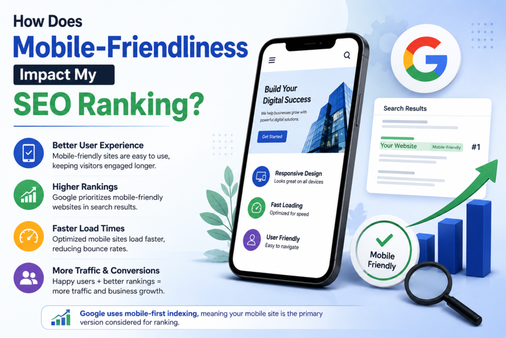
If you have ever wondered why your meticulously crafted content isn’t climbing the Search Engine Results Pages (SERPs), the culprit might be hiding right in the palm of your users’ hands.
In this comprehensive guide, we will explore how mobile-friendliness directly impacts your SEO ranking, unpack Google’s core algorithms, and provide actionable strategies to ensure your site performs brilliantly on every screen size.
1. The Paradigm Shift: Understanding Mobile-First Indexing
For years, search engines like Google evaluated and ranked websites primarily based on their desktop versions. The mobile iteration of a site was treated as an afterthought—a compressed, secondary experience. However, as mobile browsing eclipsed desktop usage, Google completely flipped the script.
What is Mobile-First Indexing?
Mobile-first indexing means that Google predominantly uses the mobile version of a website’s content for indexing and ranking. Googlebot now crawls and views the web through a “smartphone lens”.
If your website features a robust, feature-rich desktop site but a clunky, stripped-down, or broken mobile variant, your search rankings will suffer. Google evaluates your site’s structure, metadata, structured data, and content depth from a mobile perspective. If vital content or keywords are missing on your mobile pages, they effectively do not exist in the eyes of the search engine crawler.
2. Core Web Vitals and Mobile Performance
Search engines are fundamentally customer-satisfaction engines. Their primary goal is to deliver the most relevant and seamless experience to the user. This is where Core Web Vitals enter the picture—a set of metrics that measure real-world user experience regarding loading speed, interactivity, and visual stability, evaluated heavily on mobile devices.
Largest Contentful Paint (LCP): Measures loading performance. On mobile, your LCP should occur within 2.5 seconds of the page starting to load. If a mobile user has to stare at a blank screen waiting for your primary image or headline to load, they will bounce, sending negative ranking signals to search engines.
Interaction to Next Paint (INP): Measures responsiveness. Mobile users expect instant feedback when they tap a button, open a menu, or type into a form. An INP of under 200 milliseconds ensures your site feels snappy and fluid.
Cumulative Layout Shift (CLS): Measures visual stability. Have you ever tried to tap a link on your phone, only for an ad to load at the last second, causing you to click the wrong thing? That is a layout shift. Mobile layouts must maintain a CLS score of less than 0.1 to prevent user frustration.
3. Behavioral Metrics: How User Experience Drives SEO
Google’s algorithms track how real humans interact with your website. Mobile-friendliness deeply dictates user behavior, which in turn acts as an indirect ranking factor
The Bounce Rate and Dwell Time Connection
When a non-mobile-friendly site manages to rank, users who land on it via a smartphone are immediately greeted by microscopic text, horizontal scrolling requirements, or broken images. Frustrated, they smash the “back” button within seconds.
-
High Bounce Rate: A surge of immediate exits tells Google that your page did not satisfy the user’s intent.
Low Dwell Time: If users don’t stick around to read your content or explore your ecosystem, search engines deduce that your page lacks value.
Conversely, a responsive, easy-to-navigate mobile site encourages users to linger, read multiple articles, explore product pages, and engage deeply—behavioral signals that reward your site with higher organic rankings.
4. Technical Hurdles That Tank Mobile SEO
Achieving a high-ranking mobile experience requires avoiding common technical pitfalls that block search engine crawlers and frustrate human visitors.
Common Mobile Optimization Pitfalls to Avoid:
Blocked CSS and JavaScript: If your
robots.txtfile accidentally blocks Googlebot from crawling your mobile CSS or JavaScript files, the crawler cannot render your mobile layout properly, severely harming your indexation.Intrusive Interstitials (Pop-ups): Full-screen pop-ups that cover the main mobile content as soon as a user lands on a page create a terrible user experience. Google explicitly penalizes mobile pages that use intrusive interstitials, making it difficult for users to access content.
Unplayable Content: Embedding media formats (like older video plugins) that are unsupported on mobile operating systems creates dead zones on your pages.
Tiny Tap Targets: Links and buttons crammed too close together or designed smaller than the recommended 48×48 pixel standard lead to “fat-finger” errors, driving up frustration and bounce rates.
5. Best Practices: How to Optimize Your Website for Mobile SEO
Transforming your website into a mobile-friendly powerhouse requires a blend of design strategy and technical precision. Follow these steps to align your site with modern search engine standards:
Adopt a Responsive Web Design: Implement CSS media queries so your website automatically scales, resizes, and reorganizes its layout to fit any screen size—whether it is a compact smartphone or a sprawling tablet.
Prioritize Content Parity: Ensure that the text, images, videos, and internal links present on your desktop site are equally accessible on your mobile site. Do not hide core content behind accordions or tabs on mobile if it is fully visible on desktop.
Compress and Format Images: Heavy images are the number one cause of sluggish mobile load times. Use next-gen formats like WebP, leverage lazy loading, and compress file sizes without sacrificing visual clarity.
Streamline Navigation: Keep menus clean and straightforward. Utilize collapsible “hamburger” menus and incorporate a visible, fast-access search bar to help mobile users find what they need in minimal taps.
Test Relentlessly: Regularly audit your web pages using Google’s Search Console mobile usability reports and PageSpeed Insights to catch performance bottlenecks before they hurt your search rankings.
Conclusion
Mobile-friendliness is no longer just a design preference or a nice-to-have feature; it is an absolute cornerstone of modern search engine optimization. Because search engines evaluate your web presence through a mobile-first framework, your rankings, traffic, and revenue depend heavily on how smoothly your site performs on a handheld screen.
By prioritizing responsive design, accelerating your mobile load times, meeting Core Web Vitals thresholds, and maintaining complete content parity, you satisfy both search engine algorithms and human expectations. Optimize for mobile today, and watch your search visibility climb to new heights.